For many, if not all of you, December 31st was the balance sheet date for the past fiscal year. Many departments / heads of department seize the opportunity to fully use up any budget that they may have managed to save at the end of the year. This phenomenon to completely use up funds which have been allocated but not yet spent at the end of the year is sometimes also known as “December fever”. Of course, we do not want to imply any bad intentions, but some of us may even have taken the opportunity in order to be able to demand at least the same, if not even more budget next year. Reason enough for us to take a look at the volume and the amount of orders compared to the rest of the year.
Where do we find the order data in SAP?
Almost all information on a purchase order can be found in the tables for “Purchasing Document Headers (EKKO)” and “Purchasing Document Items (EKPO)”. For the purposes of this analysis, we don’t need many fields, but unfortunately these are spread over the two tables:
- Client (MANDT field)
- Company code (BUKRS field)
- Purchasing Document Number (EBELN field)
- Purchasing Document Type (BSART field)
- Net Purchase Order Value in Order Currency (NETWR field)
- Purchasing Document Item Change Date (AEDAT field)
There are basically three ways to obtain the corresponding data from the tables mentioned. You can either use a table join in SAP using the transaction “SQVI”, or use the SQL Editor using the transaction “DBACOCKPIT” – Diagnostics – SQL Editor. Alternatively, you can use SQL to access a database that has already been extracted by zap Audit. Procedures two and three are essentially pretty similar, so we’ll start with the SQL procedure here.
As soon as we have SQL access, we can use a simple SQL query to get the necessary data:
SELECT K.EBELN, SUM(P.NETWR), K.BSART, K.MANDT, K.BUKRS, K.AEDAT FROM EKKO AS K, EKPO AS P WHERE K.EBELN = P.EBELN AND K.AEDAT >= ‘2016-01-01’ AND K.AEDAT <= ‘2016-12-31’ GROUP BY K.EBELN, K.MANDT, K.AEDAT, K.BUKRS, K.BSART
Or, using the SQL Editor in SAP (tested with Hana):
SELECT K.EBELN, SUM(P.NETWR), K.BSART, K.MANDT, K.BUKRS, K.AEDAT FROM EKKO AS K, EKPO AS P WHERE K.EBELN = P.EBELN AND K.AEDAT >= ‘20160101’ AND K.AEDAT <= ‘20161231’ GROUP BY K.EBELN, K.MANDT, K.AEDAT, K.BUKRS, K.BSART
Note the difference in the display of the date formats. Your SAP system may save the date in a different format, so you must adjust the query accordingly. If you need help with this, don’t hesitate to contact us here.
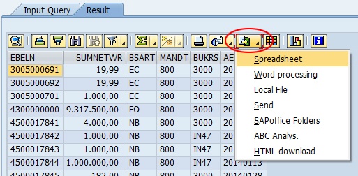
Now, we export the results as usual by clicking on:

Of course, you can always still filter the results in Excel for a specific company code. To keep things simple though, we did not do this at this stage.
Preparation of the data
SAP does not make things easy for us when it comes to the date format, so we have to format the date in Excel before we can make any meaningful use of it.
After opening the export, the creation date (AEDAT) is displayed as follows:
20140219
It starts with the year, followed by the month and ends with the day. Unfortunately, we cannot simply format the date so that Excel recognizes that it is a date. That is why we must first separate the figures and then generate a reasonable date:
| AEDAT | Year | Month | Day | Date |
|---|---|---|---|---|
| 20141111 | =LEFT(F2; 4) | =LEFT(RIGHT(F2;4); 2) | =RIGHT(F2;2) | =DATE(G2;H2;I2) |
The table shows the distribution and creation of the date with simple Excel formulas. If you know a faster or better method of doing this, please let me know in the comments.
Viewing purchase order data from SAP
After we have prepared the data, we can now begin to actually evaluate and visualize the data obtained. To do this, we first create a pivot table using “Insert – PivotTable”. Excel should automatically select the complete table so that we can edit the PivotTable by clicking on “Ok”. On the right, we select the following setting for the PivotTable fields:
Rows: date
Values: EBELN (document number) and SUMNETWR (sum of the net order value in purchase order currency)
This already gives us a good overview of how many times orders were placed in which months and the value of the orders placed. However, as soon as there are more than 7 numbers in the SUMNETWR column, the table quickly becomes confusing, so we have to take a closer look to establish whether there were 3 or 5 million-worth of orders in February.
For this reason we let Excel draw us another chart. This is not only clearer and easier to understand but it’s also easier to present to management too! 🙂
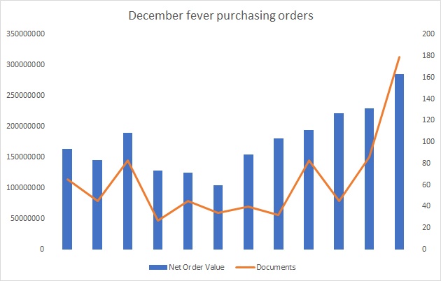
Via “Insert – Charts – Recommended Charts – All Charts – Combo”, we select the second chart with the name “Clustered Column / Line on Secondary Axis”. We use the columns to display the net value and the number of documents is displayed as a line. The result will then look something like this:

After an average beginning to the year and a rather sluggish summer, the great order euphoria follows, with a small downturn in October. At this point, it’s over to you once again: if you see that such a trend has occurred, then why not analyze what was ordered and especially why it was ordered at the end of the year? There may of course also be some very good reasons for this. Either that or your company produces very seasonal products, if so then it might not necessarily be anything unusual.
